COMMUNICATION. The University of Gothenburg’s new website has now been launched after several years of preparations at every level. Much of the work has been about ensuring that the website’s various functions can work with each other and cleaning out information that does not belong on an external site.

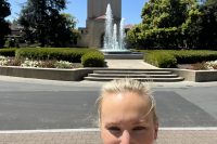
“Finally!” exclaims Nina Raun, when I ask how it feels that the new site has at last been launched.
She is one of two communication officers employed last year for a limited time by the Institute of Medicine, the University’s largest institute, to ensure that the site launch would be completed on time. She feels it has been a rewarding journey, with many people contributing along the way.
“I was surprised by the commitment and interest among staff to help and create the new website, with everything from feedback on texts to taking photographs. I have really appreciated the good interactions with the organizations to produce the new material,” adding that it seems that the new website has been well received so far by the institutes.
Only external information
Josefin Bergenholtz is the communication officer at the Institute of Neuroscience and Physiology and has led much of the work together with an assistant web editor and six editors appointed at section level. Preparations in advance of the launch have been ongoing for two years, including reviewing and cleaning out all the old pages.

“We have worked for a long time to prepare for the new website. An example is how we have reviewed what information we should actually have on the external site, and reworking and moving a lot to internal pages in the Employee Portal and the Student Portal to streamline the external site.
About 10 percent remains
Josefin’s institute is not the only one where cleaning out material not needed on a modern external website has taken a lot of time. For the Institute of Medicine, its external site has shrunk from the previous 1,100 to 100 pages.
“A lot of information has been moved to internal pages, while old and outdated information has been eliminated. The old site was something of a web cemetery, so we have put a lot of time into producing new material, especially about our research. Now we have a more content-rich, updated, and audience-appropriate website where it is easier to find information,” says Nina Raun.
The University of Gothenburg’s website has a huge need for images, which requires large photos taken from activities on virtually every page. To this end, the Institute of Medicine has conducted a large photo project, where they worked with employees on site to ensure good quality photos were taken showing the work at the institute.
Parallel development
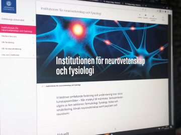 Since the website project is University-wide and different functions have been developed in parallel by different work groups, it has been difficult really to work efficiently and in a structured way, says Josefin Bergenholtz.
“We were given access to two of the systems that the new website is based on at the beginning of the year, but some functions and integrations were not in place yet; they were developed during the spring and summer. It has been a bit messy and involved a lot of duplicate effort, but now the foundation has been laid, and it is wonderful that the website has finally been launched. Development of the site continues, and we hope that we will soon have the opportunity to publish such things as student portraits, more photos, and the program catalog.
Web editors help each other
At Sahlgrenska Academy, the web editors from the institutes have formed a joint group, led by the faculty communication officer Åsa Ekvall. The group discusses stumbling blocks and inspires each other in their website work.

“Something that has worked really well are the templates that have been developed for research projects, where researchers have contributed texts. I am very impressed that the project chose to work with this form and can see that the field of Health and Medicine now has over 400 research projects described on our website, where you get in-depth information about who funds the research and what collaborations are taking place,” says Åsa Ekvall.
Update personal pages
The institute’s web communication officers continue to meet, as there is still a lot of work to be done with the external site even after the launch. This includes the need for more high-quality photos and the English pages needing more work. At the faculty level, the pages for doctoral education also need to be more clearly focused on the recruitment of doctoral students.
Åsa Ekvall points out that many personal pages still need to be updated. Search for your name under Search and Find staff to see what your page looks like. Instructions on how to update pages are found here. (https://medarbetarportalen.gu.se/verktyg/pop/)
User centered
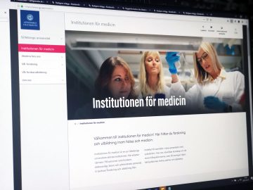 The new website is designed to allow visitors to more easily find what they are looking for and to effectively do what they want to do. The site is less structured around the University’s organization, and more focus is given to the user’s needs and expectations. For example, the site has been equipped with a much better search engine where you can define within what area you want to search, like Find research, and see the results for this area. This avoids a long list of every hit mixed together.
“A basic idea with the new website is also to reduce the number of people who work with it. It will be a better site and work will be more efficient if fewer employees use a larger part of their time working with the site,” says Åsa Ekvall.
The other day, the web communication officers met at Medicinareberget, at an appropriate social distance, for a party with cake to celebrate a job well done.
TEXT: ELIN LINDSTRÖM
